North Coffee
Creating a warm and distinctive visual identity for an independent coffee company.
01 — Overview
Project overview
North Coffee is an independent roasting company with a focus on origin stories and neighborhood hospitality. The brand needed to feel warm, distinctive, and ready for growth beyond a single location.
- Client
- North Coffee
- Industry
- Food & Beverage
- Role
- Brand Designer
- Timeline
- 2.5 months
- Services
- Brand Identity, Packaging Direction, Art Direction, Guidelines
02 — Challenge
The challenge
The existing identity felt handmade but inconsistent. As the company prepared to expand wholesale and retail, it needed a system that preserved character while gaining coherence.
- Identity lacked consistency across touchpoints
- Packaging didn't communicate origin quality
- Digital presence felt disconnected from in-store warmth
- Need for scalable brand assets for wholesale partners
03 — Research
Discovery & insights
Customer interviews, competitor shelf audits, and visits to the café informed a direction rooted in warmth, craft, and northern clarity.
Insight 01
Customers valued honesty and origin storytelling over trend aesthetics
Insight 02
Warm browns outperformed stark black-and-white on shelf
Insight 03
A flexible mark worked better than a rigid logo lockup
Insight 04
Staff wanted simpler brand tools for seasonal campaigns

04 — Strategy
Strategic direction
Build a brand that feels like a trusted neighborhood roast—warm, clear, and quietly confident.
- 01Lead with tactile color and approachable typography
- 02Create packaging that celebrates origin
- 03Design a flexible system for seasonal expression
- 04Connect café experience to digital storytelling
05 — Exploration
Design exploration
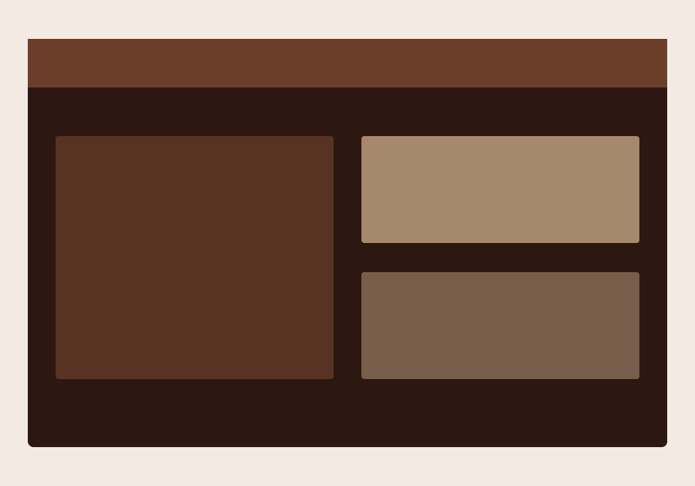
Early concepts, wireframes, and visual explorations that shaped the final direction.
06 — Visual System
Visual foundations
Deep espresso tones, soft cream, and copper accents create a hospitality-forward brand that still feels contemporary.
Principles
- Warmth with clarity
- Craft without nostalgia overload
- Flexible seasonal expression
- Origin storytelling
Palette
Typography
- Characterful display
- Readable sans for menus and labels

07 — Final Designs
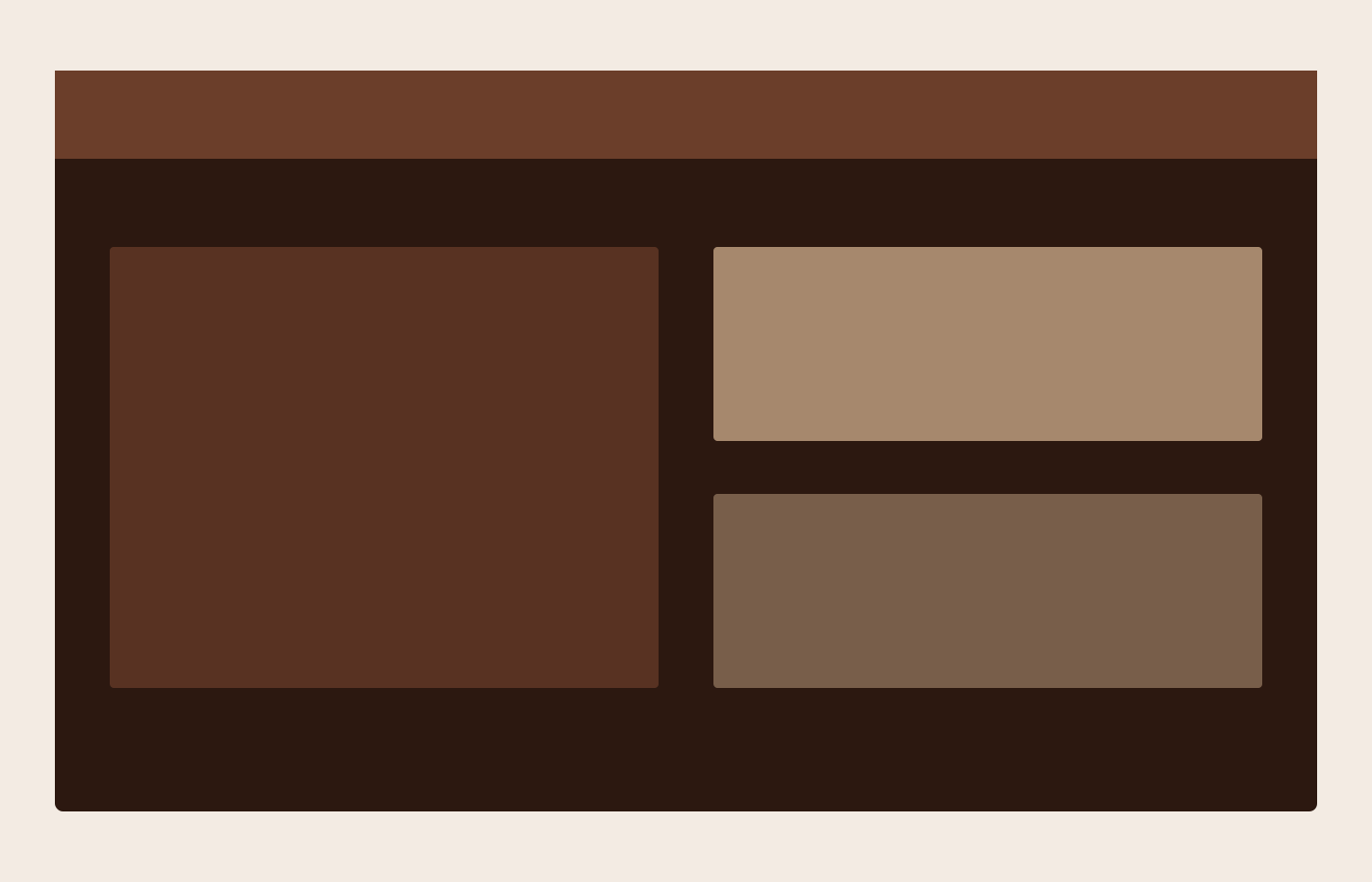
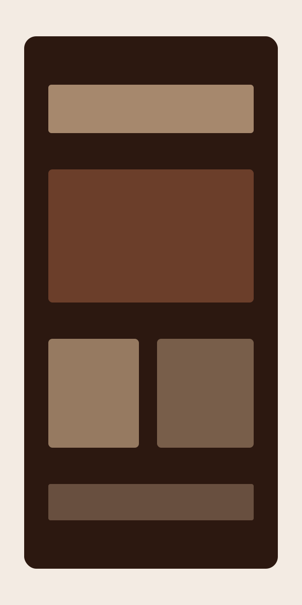
The finished work

08 — Solution
How it came together
A warm identity system with a distinctive wordmark, earthy palette, and packaging language that celebrates coffee origins while supporting retail and wholesale growth.
09 — Outcome
Results & impact
The rebrand supported wholesale expansion and strengthened in-store recognition. Sample metrics below.
Sample metrics for demonstration
+22%
wholesale inquiries
+41%
packaging recognition
3x
brand asset usage
10 — Reflection
Looking back
What worked
Anchoring the system in warmth and origin storytelling kept the brand human while making it more professional.
What was learned
Independent food brands need systems that empower staff—not just lookbooks that sit unused.
What would improve
A richer illustration language for seasonal drops would give campaigns more range.

Next Project
Field Notes
Editorial Design