Field Notes
An editorial platform designed around stories, culture, and visual exploration.
01 — Overview
Project overview
Field Notes is a digital editorial platform exploring culture, place, and visual storytelling. The design needed to feel magazine-like—rich in typography and imagery—while remaining easy to browse and publish into.
- Client
- Field Notes Collective
- Industry
- Media & Culture
- Role
- Editorial & Digital Designer
- Timeline
- 4 months
- Services
- Editorial Design, Art Direction, Web Design, Content Design
02 — Challenge
The challenge
The team had strong content but an uneven reading experience. Stories needed better pacing, clearer hierarchy, and a system that could support long-form essays and visual essays alike.
- Long-form reading lacked rhythm and hierarchy
- Visual essays competed with text-led articles
- Navigation didn't support discovery by theme
- CMS constraints limited layout flexibility
03 — Research
Discovery & insights
Content audits, reader interviews, and competitive reviews of independent magazines informed a flexible editorial system.
Insight 01
Readers wanted stronger openings and clearer story framing
Insight 02
Theme-based browsing increased exploration
Insight 03
Image-led and text-led templates needed equal craft
Insight 04
Subtle motion improved sense of editorial quality
04 — Strategy
Strategic direction
Design Field Notes as a living magazine—structured enough for publishing, expressive enough for art direction.
- 01Create modular story templates
- 02Elevate typography as the primary interface
- 03Support theme-based discovery
- 04Balance consistency with expressive layouts
05 — Exploration
Design exploration
Early concepts, wireframes, and visual explorations that shaped the final direction.

06 — Visual System
Visual foundations
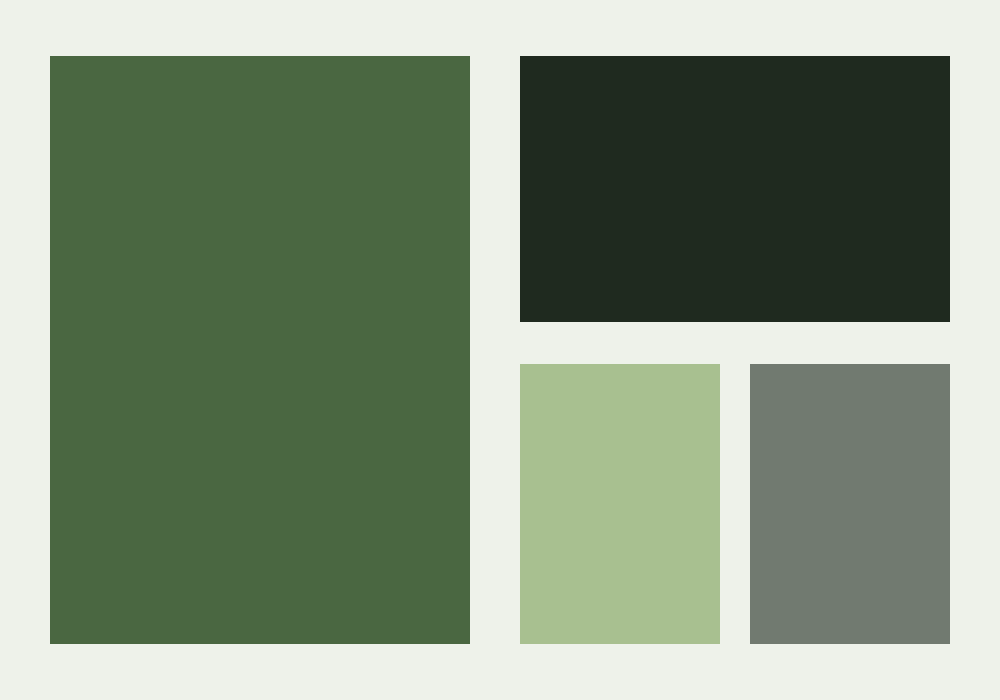
Forest greens and soft paper tones set a reflective editorial mood, with strong display type leading each story.
Principles
- Typography as interface
- Pacing over density
- Modular expressiveness
- Quiet discovery
Palette
Typography
- Literary display serif
- Readable text face for long-form
07 — Final Designs
The finished work

08 — Solution
How it came together
An editorial design system and digital platform with expressive article templates, refined typography, and browsing patterns that encourage deeper exploration.
09 — Outcome
Results & impact
Readers spent more time with stories and explored more related content. Sample metrics below.
Sample metrics for demonstration
+36%
time on article
+29%
related story clicks
+18%
returning readers
10 — Reflection
Looking back
What worked
Building a small set of expressive templates gave editors creative range without sacrificing consistency.
What was learned
Editorial products succeed when systems respect content rhythm—not when every page looks identical.
What would improve
A more advanced search and save experience would support heavier readers.
Next Project
Nova Finance
Product Design