Frame Studio
A digital portfolio experience for an architecture and interior design studio.
01 — Overview
Project overview
Frame Studio needed a digital presence that reflected the precision and atmosphere of their physical work. The site had to feel architectural—composed, spacious, and image-led—while remaining easy for clients to navigate.
- Client
- Frame Studio
- Industry
- Architecture & Interiors
- Role
- Web Designer & Creative Director
- Timeline
- 4 months
- Services
- Creative Direction, Web Design, Interaction Design, Art Direction
02 — Challenge
The challenge
Previous site designs buried projects behind dense navigation and didn't give photography the room it deserved. The studio needed a site that felt like an exhibition, not a brochure.
- Photography needed to lead every page
- Project storytelling felt fragmented
- Mobile experience lacked intentional composition
- Studio philosophy wasn't clearly expressed
03 — Research
Discovery & insights
We reviewed peer studio sites, analyzed how clients browse project work, and mapped content priorities with principals and project managers.
Insight 01
Clients decide within the first few project images whether to continue
Insight 02
Case studies needed clearer spatial narrative
Insight 03
Minimal chrome increased perceived craft quality
Insight 04
A strong about story improved inquiry quality
04 — Strategy
Strategic direction
Treat the website as a curated gallery—large imagery, editorial pacing, and quiet interaction details.
- 01Lead with immersive project photography
- 02Use typography as structure, not decoration
- 03Design intentional mobile compositions
- 04Create a calm inquiry path for new clients
05 — Exploration
Design exploration
Early concepts, wireframes, and visual explorations that shaped the final direction.
06 — Visual System
Visual foundations
Near-monochrome foundations with precise spacing create a gallery-like frame for photography and project narratives.
Principles
- Space as a material
- Image first, interface second
- Quiet motion
- Architectural alignment
Palette
Typography
- Sharp display serif
- Neutral sans for meta and body
07 — Final Designs
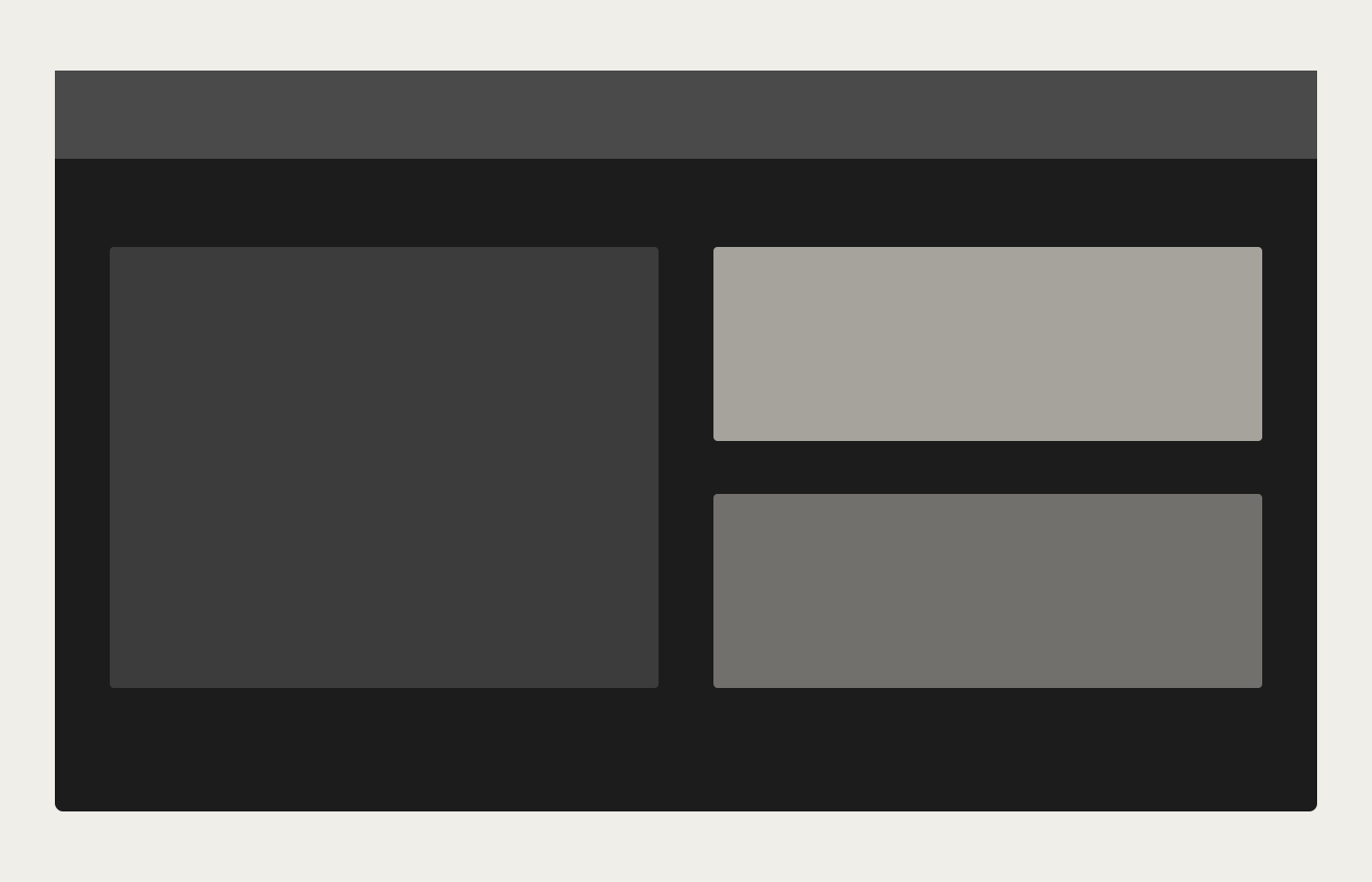
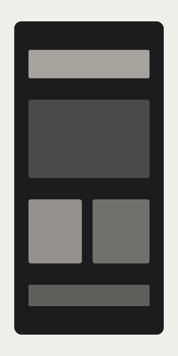
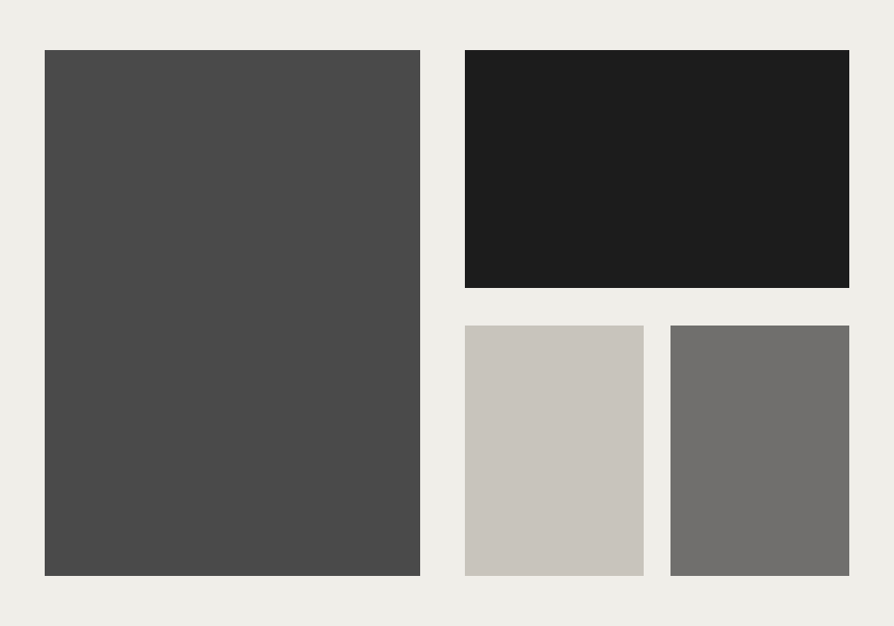
The finished work
08 — Solution
How it came together
An editorial web experience with full-bleed project storytelling, refined motion, and a navigation system that stays out of the way of the work.
09 — Outcome
Results & impact
The redesigned site elevated project presentation and improved inquiry quality. Sample metrics below.
Sample metrics for demonstration
+55%
project page engagement
+27%
qualified inquiries
-40%
bounce rate
10 — Reflection
Looking back
What worked
Committing to large imagery and restrained UI made the studio's craft immediately visible.
What was learned
Architecture clients respond strongly to pacing—how the story unfolds matters as much as the images themselves.
What would improve
A more advanced project filter taxonomy would help larger archives scale gracefully.
Next Project
Orbit AI
Product Design