Aurelia
Building a refined identity system for a contemporary wellness brand.
01 — Overview
Project overview
Aurelia is a contemporary wellness brand focused on rituals, rest, and intentional living. The identity needed to feel elevated and calm while remaining flexible across packaging, digital, and retail environments.
- Client
- Aurelia Wellness
- Industry
- Wellness
- Role
- Brand Designer
- Timeline
- 3 months
- Services
- Visual Identity, Art Direction, Typography, Brand Guidelines
02 — Challenge
The challenge
The wellness category is visually saturated with soft pastels and generic wellness tropes. Aurelia needed a distinctive system that felt premium, modern, and emotionally grounded.
- Stand out in a crowded wellness market
- Balance softness with sophistication
- Create a system usable across packaging and digital
- Establish a voice that feels warm, not clinical
03 — Research
Discovery & insights
Competitive audits, mood research, and stakeholder workshops helped define a positioning between spa-like calm and contemporary design craft.
Insight 01
Customers associated trust with restraint and material quality cues
Insight 02
Overly decorative marks felt less premium in testing
Insight 03
Warm neutrals outperformed cool pastels for brand memorability
Insight 04
Typography carried more brand recognition than the mark alone
04 — Strategy
Strategic direction
Position Aurelia as quiet luxury for everyday rituals—elegant, human, and never loud.
- 01Lead with typography and tactile color
- 02Build modular identity applications
- 03Design for both stillness and motion
- 04Create guidelines that empower partners without diluting the brand
05 — Exploration
Design exploration
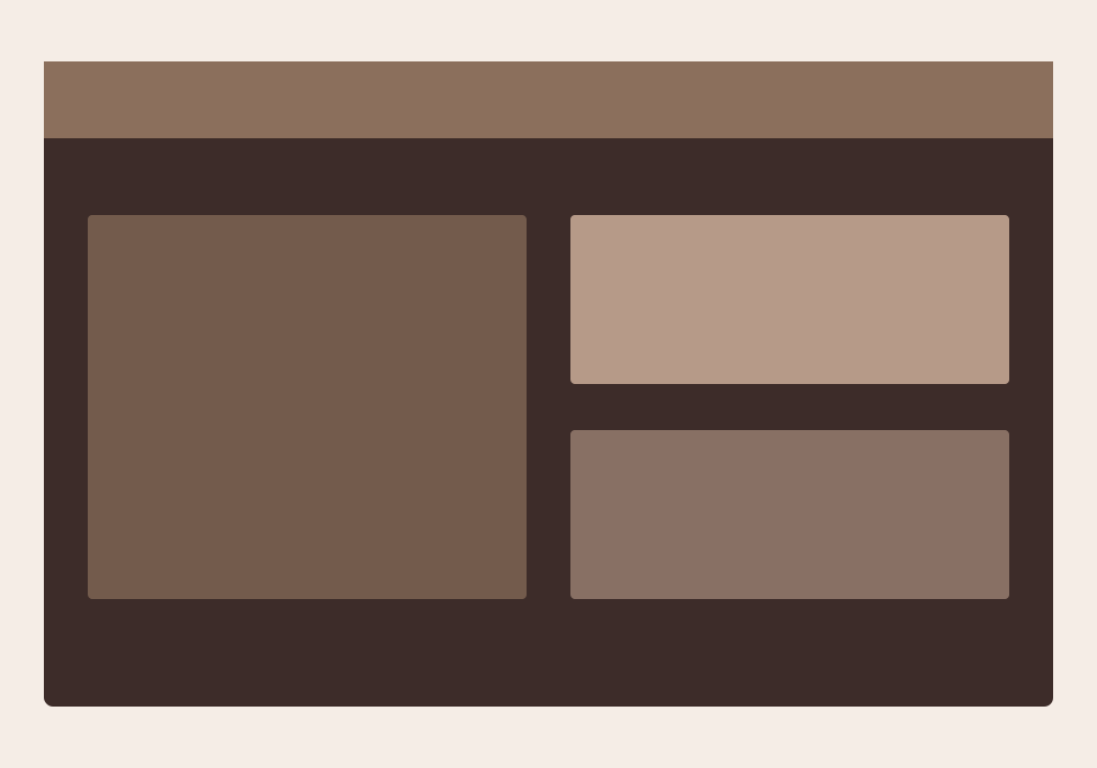
Early concepts, wireframes, and visual explorations that shaped the final direction.
06 — Visual System
Visual foundations
Earthy neutrals, soft terracotta undertones, and an elegant serif/sans pairing create a calm but distinctive presence.
Principles
- Restraint as luxury
- Material honesty
- Breathing room in every composition
- Typography as identity
Palette
Typography
- Refined serif for brand moments
- Soft sans for product and UI
07 — Final Designs
The finished work
08 — Solution
How it came together
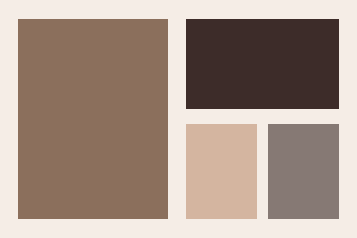
A refined identity system anchored by a custom wordmark, warm mineral palette, and flexible art direction that scales from product labels to digital campaigns.
09 — Outcome
Results & impact
The new identity launched across packaging and digital channels with strong brand recognition in early campaign testing. Metrics below are sample placeholders.
Sample metrics for demonstration
+38%
brand recall
4.8/5
perceived quality
2x
social engagement
10 — Reflection
Looking back
What worked
Letting typography lead the identity created a system that felt distinctive without relying on a complex symbol.
What was learned
Wellness brands benefit from clearer visual tension—too much softness can flatten personality.
What would improve
A deeper motion language for digital campaigns would extend the brand's presence further.
Next Project
Frame Studio
Web Design